EXTREME DIVIDENDS INVESTOR GROUP – Charts – a special educational article
Hi Everyone
Sometimes we discuss optimal buying times based on a mystical part on the stock market analysis (charts) employed by both technical individuals and automated algorithm trading.
When non pilots visit the cabin of an airliner, they are absolutely dumbfounded by the huge array of gauges, screens, buttons, dials, pedals and levers constantly in use by pilots and computers to move the plane safely from point A to Point B. The safest and most efficient pilots are experts at reading charts and utilizing all the dials and buttons. Cockpit time can be very busy and stressful with all the different inputs and outputs the flight crew deals with constantly – less so with the modernization of computer flight systems (when you can trust them).
New and non-technical investors can also be overwhelmed when they first look at stock market charts and the hundreds of analytical widgets chartist creators apply to tune in on investing decisions. But just like pilots who get trained and practiced to focus on key elements during a flight, we as investors with the help of the internet, youtube webinars, articles, etc., can become familiar with the widgets that can help us the most in both our types of investing and, if relevant, trading.
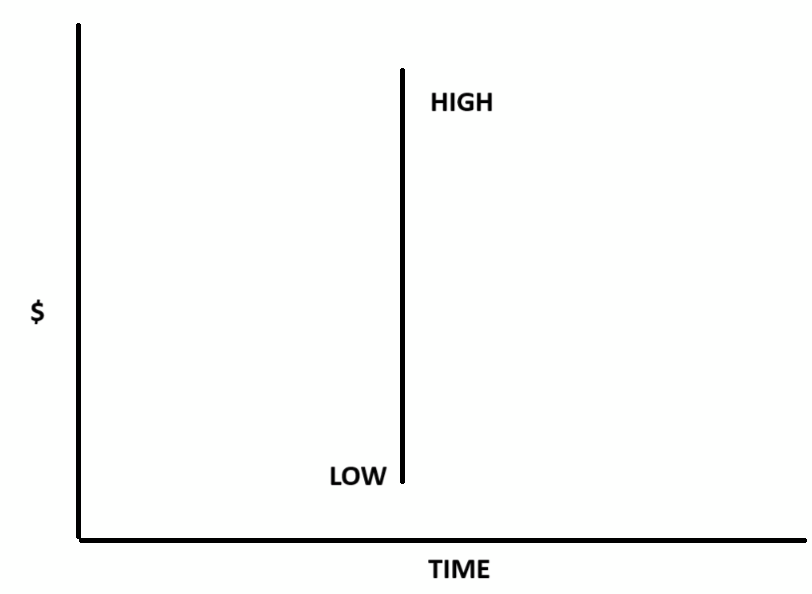
CANDLESTICKS: Everyone may be familiar with line graphs where one axis is time, the other is price and an average line curve of a stock’s price is plotted as it varies over a year or a single day. However, a much more informative graph system employs colored candlesticks. Once you understand the candlestick you will always make it your primary graph display. It is called a candlestick because it looks like a freshly made candle rectangular in the body with a wick sticking out of both ends. The basics are simple but your understanding at a glance can be very powerful. For example:
- The bottom and top of the vertical wick show the lowest and highest price within any given time frame.
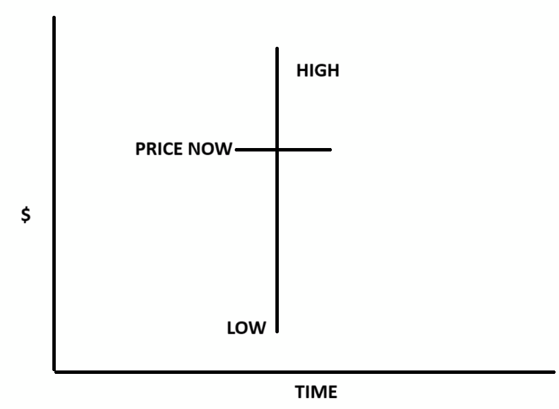
- The horizontal line crossing the wick represents the current active price.
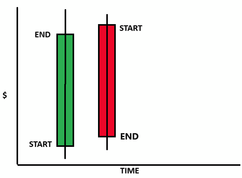
- In the case of a green candle the bottom of the rectangle represents the starting price and the top shows the closing price in the relative time period. In the case of a red rectangle the opening and closing prices are inverted.
- Big candles in short time frames, imply institutional trading. Big (sustained) candle moves are not always accompanied by huge jumps on the volume charts. Candlesticks are price, not volume driven.
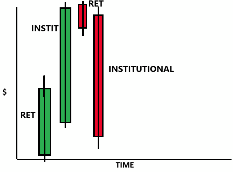
While the size of the candle does indeed demonstrate the trading range within a given time period, experts use the size of a candle to quickly identify stock movements as institutional or retail. Institutional trading is an important awareness indicator for us because with their resources they usually buy or sell faster on the basis of more information than retail investors like us have access to.
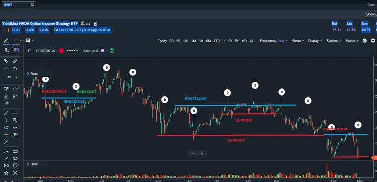
SUPPORT, RESISTANCE, and BREAKOUTS and BREAKDOWNS: Because of a mix of repeatable human behavior and because of the deliberate profit driven PROGRAMMED algorithms used by institutional traders and investors based also on stock histories, a quick look at a chart can tell us bargain hunters how low a stock might drop within a given time frame (SUPPORT LINE) or where it might become unreasonably expensive for our buying strategy (RESISTANCE LINE). Our goal is to always be in on receiving wonderful extreme dividends, which FREQUENTLY exceeding 100%/yr. In order to do that we invest minimal amounts when we have to near the resistance lines and by buying significant (support line) dips we average our COSTS DOWN and our YIELDS UP.
When important events occur, news can heavily influence prices creating BREAKOUTS and BREAKDOWNS. These obviously drive stocks past Support and Resistance levels but they don’t always last. On the eTrade Pro-Platform chart of our NVDY below is illustrated both SUPPORT and RESISTANCE lines along with BREAKDOWNS and BREAKOUTS.
The amount of money you save by greedily picking the best buying points can significantly boost your profits.
OTHER TOOLS USEFUL FOR BEST PRICE PICKING OF EXTREME DIVIDEND SHARES INCLUDE:
- One tool heavily used by successful Day Traders, is a simple line called VWAP (volume weighted average percent). As a stock price crosses the VWAP line it is usually headed up for a while. Traders jump in just as it crosses and usually create programmed exit points as it climbs, e.g., selling portions at +10%, +15%, +20% to collect their profits. If the price hooks down for a minute or two, they bail out and bank their profit. Similarly, bargain hunters like us wait for a below the VWAP line price pattern to hook upwards for a minute or two before buying in.
- Another very useful aid for choosing useful price targets is the VOLUME PROFILE or VOLUME BY PRICE tool. This is a dynamic horizontal bar graph that for any plotted time range shows the most and least popular trading prices of any stock plotted. In heavily traded price ranges, chances are the stocks will return.
- For helpful information on both these tools click the above links
I hope these informational tidbits help your buying and raise your profitability.
Regards,
Clint